Lin’s Shiny Notes
Lin Yu
2023-06-16
1
Elements
helper.R:
load libraries,
read data sets,
generate values, tables, plots
ui.R :
design layout of your dashboard
server.R:
render
2
ui.R
header+sidebar+body: ui <- dashboardPage(header, sidebar, body )
source('helper.R',encoding = 'utf-8')header <- dashboardHeader(title = HTML("Name of your dashboard"), disable = FALSE, titleWidth = 520 ## change this )sidebar <- dashboardSidebar( width = 200, sidebarMenu( id = 'sidebar', style = "position: relative; overflow: visible;", menuItem("menu label 1", tabName = 'tab1', icon = icon('dashboard'), badgeLabel = latest_pts_date, badgeColor = "green" ), menuItem("menu label 2", tabName = 'tab2', icon = icon('dashboard'), badgeLabel = '', badgeColor = "green" ) ) )3
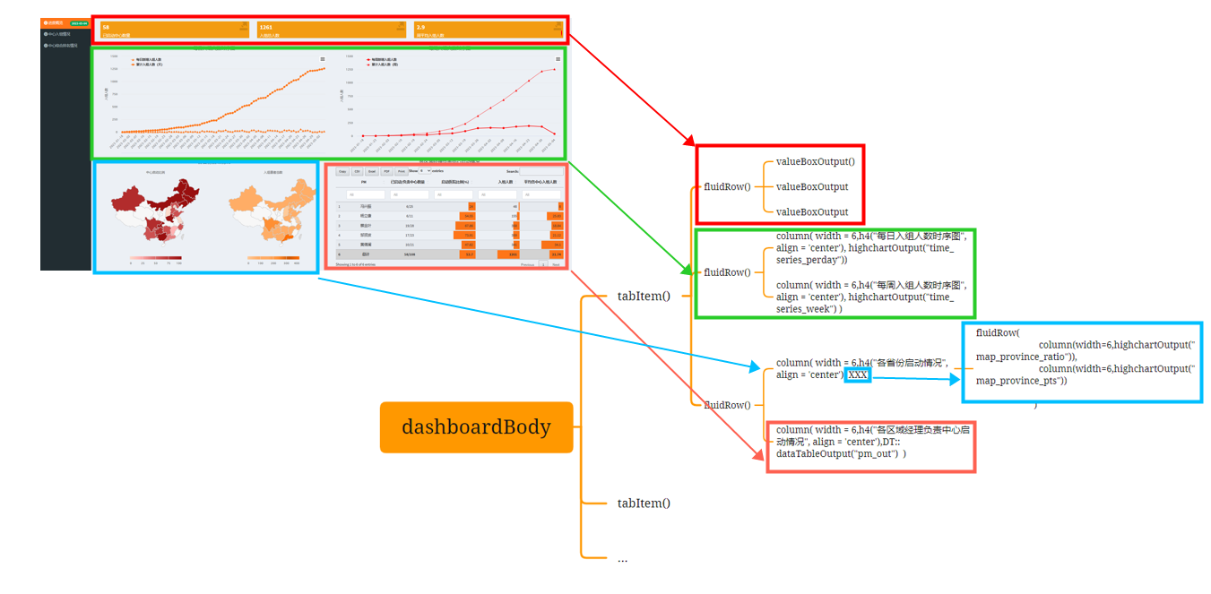
ui.R (cont'd)
body <- dashboardBody( ### tab1------ tabItem( tabName = 'tab1', fluidRow( valueBoxOutput("enroll_hosp_tot_box") ), fluidRow( column( width = 6,h4("每日入组人数时序图", align = 'center'), highchartOutput("time_series_perday")) ), fluidRow( column( width = 6,h4("各省份启动情况", align = 'center'), fluidRow( column(width=6,highchartOutput("map_province_ratio")), column(width=6,highchartOutput("map_province_pts")) ) ), column( width = 6,h4("各区域经理负责中心启动情况", align = 'center'),DT::dataTableOutput("pm_out") ) ) ), ###tab2--------- tabItem( tabName = 'tab2',## place holder ) )4
ui layout
5
server.R
server <- function(input, output, session) { ### 1. overall----------- output$enroll_tot_box <- renderValueBox({ valueBox( VB_style(enroll_tot , "font-size: 60%;" ),"入组总人数", icon = icon('export', lib = 'glyphicon'), color = "yellow" ) }) output$time_series_perday <- renderHighchart({p_time_series_cumday}) output$top10_time_series <- renderPlotly({ ggplotly(p_top10_time_series,height = 400,width = 800) }) output$dy_rank <- renderUI({ p_dynamic_plot}) output$pm_out <- DT::renderDataTable({ DT::datatable(pm11, filter='top', editable = 'cell',extensions = 'Buttons', options = list(dom = 'Blfrtip', scrollX = TRUE, scrollY = TRUE, buttons = c('copy', 'csv', 'excel', 'pdf', 'print'), lengthMenu = list(c(nrow(pm11),25,50,100,-1), c(nrow(pm11),25,50,100,"All")), columnDefs = list(list(className = 'dt-center', targets = c(1,2))), columnDefs = list(list(className = 'dt-left', targets = c(3:5))) )) %>% formatStyle(columns = 'PM', target = 'row', fontWeight = styleEqual(c('总计'), c('bold')), backgroundColor = styleEqual(c('总计'), c('lightgrey'))) %>% formatStyle( c('启动医院比例(%)'), background = styleColorBar( c(0,max(pm11$`启动医院比例(%)`)*2) , '#ff7518'), backgroundSize = '100% 90%', backgroundRepeat = 'no-repeat', backgroundPosition = 'center' ) %>% formatStyle( c( '入组人数'), background = styleColorBar( c(0,max(pm11$入组人数)*2) , '#ff7518'), backgroundSize = '100% 90%', backgroundRepeat = 'no-repeat', backgroundPosition = 'center' )%>% formatStyle( c( '平均各中心入组人数'), background = styleColorBar( c(0,max(pm11$平均各中心入组人数)*2) , '#ff7518'), backgroundSize = '100% 90%', backgroundRepeat = 'no-repeat', backgroundPosition = 'center' ) }) }6
host app
Ubuntu:
- change work directory:
cd "/mnt/e/2023/0324asthma registry/asthmaapp0417"show current work:
top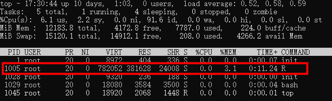
stop R work (if necessary): kill
- run the app:
nohup R -e 'shiny::runApp(host = getOption("shiny.host", "0.0.0.0"),port = 1017)' > /mnt/e/2023/0324asthma registry/asthmaapp0417/asthma_app_out.log 0>&1 &
7
Thanks!
9